Overview:
- Similar to the KDE plot, the box Plot also is a non-parmateric statistical method.
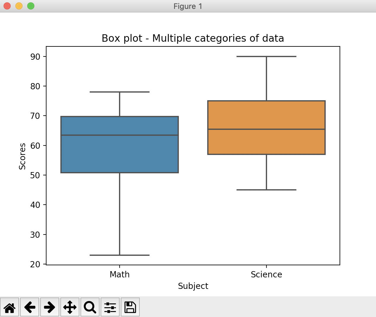
- A box plot depicts the three quartiles of a data along with the minimum and maximum values of the data.
- In a box plot, the three quartiles of the data are represented through a box with a line at the middle of the box.
- In a horizontal box plot, the left hand side edge of the box represents the first quartile(Q1). The middle division of the box represents the median i.e., the second quartile(Q2). The right hand side edge of the box represents the third quartile(Q3).
- In a vertical box plot, the lower edge of the box represents the first quartile(Q1). The middle division of the box represents the median i.e., the second quartile(Q2). The upper edge of the box represents the third quartile(Q3).
- The whisker that extends from the first quartile ends at the minimum value of the data. The other whisker ends at the maximum value of the data.
- The distance between the third quartile(Q3) and the first quartile(Q1) is known as the Inter Quartile Range(IQR).
Quartiles:
- Quartiles are the three cut points that divide the data into four equal sized groups.
- The first cut point is called the first quartile, the second cut point is called the second quartile and the third cut point is called the third quartile.
Box plot in seaborn:
- The function boxplot() from the Python visualization library seaborn draws box plot(s) for univariate and multivariate data.
- The seaborn visualization library is built using the matplotlib as the underlying. While The seaborn library provides more visulizations like hue semantics, the box plot can be drawn using matplotlib as well.
Example 1:
|
# Example Python program that draws a box plot using the seaborn # Scores obtained by students on a math test #Draw a box plot |
Output:

Example 2:
This example draws multiple boxes, one for each distribution under a category. Quartiles for the math scores and science scores are drawn using separate boxes.
|
# Example Python program that draws a box plot using the seaborn scores = {"Scores":[23, 45, 60, 61, 67, 70, 78, 90], #Create a pandas DataFrame # Draw a box plot of scores on each subject |
Output: