Overview:
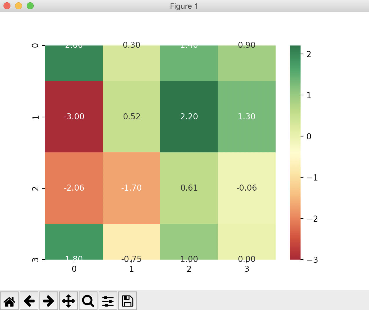
- A heatmap represents a matrix of information with transforming colors. There could be fewer to many colors typically from lighter ones to darker ones. The transformations and the intensity nature of the colors represent how the piece of information corresponding to the cell is changing in a specific time with respect to other cells.
- There are several scenarios where heatmaps come as a visual tool aiding in faster analysis. Price and volume movements of stocks from a major stock market index, COVID19 pandemic scenario across states are some of the examples.
Heatmap in seaborn:
-
A 2x2 numeric ndarray or a pandas DataFrame can be passed to the heatmap() function of the seaborn library.
Example:
|
# Example python program that draws a heatmap # List of percentage changes columns = 4; # Create a 2x2 ndarray # Fill in the 2x2 ndarray print("Stock prices:"); # Create a heatmap and display |
Output: